Choosing your wedding color scheme is so much more than selecting a few pretty shades to match your bridesmaids’ dresses. Color is the ultimate emotional anchor of your entire celebration. It dictates the atmosphere, influences your floral design, guides your lighting production, and ultimately shapes how your guests feel from the moment they step into your venue.
As we move through the 2026 wedding season, couples are completely rewriting the rulebook. The era of playing it safe with standard, washed-out pastels is officially behind us. Today’s design landscape is defined by intentionality, editorial flair, and deeply personal storytelling through color. From high-contrast jewel tones making an impact on city rooftops to earthy, sun-baked neutrals creating a sense of “quiet luxury” in outdoor villas, the best color combinations for wedding decor this year are all about confidence and character.
Whether you are a bride finalizing your mood board, a groom wanting a cohesive aesthetic, or a professional wedding planner looking for the freshest design inspiration, this ultimate guide will break down the top trending palettes for 2026, complete with styling tips, seasonal breakdowns, and expert-backed strategy.
Master Table: Top 10 Color Combinations for Wedding Decor
To give you an immediate snapshot of the year’s top design directions, here is a breakdown of the leading color combinations, their signature emotional mood, and the wedding styles they complement best.
| Primary Color Combination | Supporting Accents | Emotional Mood | Best Suited For |
| Black Cherry & Aubergine | Creamy Ivory, Gold | Moody, Luxurious, Dramatic | Historic Villas, Ballroom Receptions, Evening Soirées |
| Tomato Red & Peachy Gold | Lavender Micro-accents | Optimistic, Playful, Daring | Summer Estates, Modern High-Fashion Weddings |
| Cobalt Blue & Clean White | Silver Mist, Touch of Orange | High-Style, Editorial, Artistic | City Rooftops, Contemporary Art Galleries |
| Eucalyptus & Soft Terracotta | Cream, Matte Gold | Organic, Grounded, Quiet Luxury | Garden Ceremonies, Rustic Barns, Courtyards |
| Butter Yellow & Dove Grey | Sage Green, Crisp White | Softly Radiant, Nostalgic, Fresh | Spring Mornings, Outdoor Countryside Weddings |
| Lavender Smoke & Silver Lilac | Cloud White, Cool Charcoal | Futuristic Softness, Ethereal | Cocktail Nights, Edgy Romantic Receptions |
| Emerald Forest & Deep Moss | Vintage Champagne, Pearl | Royal Heritage, Earthy Luxury | Castle Weddings, Forest Clearings, Winter Galas |
| Saffron Glow & Tuscan Marigold | Earthen Clay, Cane Textures | Festive Warmth, Cultural Opulence | Haldi Ceremonies, Sun-drenched Day Events |
| Pearl White & Porcelain Ivory | Clear Acrylic, Matte Textures | Minimalist Luxe, Ultra-Clean | Contemporary Glass Houses, Classic Vow Renewals |
| Cocoa Brown & Caramel Latte | Warm Taupe, Brass Lanterns | Cozy, Intimate, Grounded | Autumn Woodland Weddings, Late-Night Lounges |
Deep Dive: The Best 2026 Wedding Color Palettes & How to Style Them
Let’s look closely at the standout combinations defining this season. When designing with these palettes, remember that the secret lies in layering textures—like velvet, raw silk, linen, or colored glassware—rather than simply matching every item to the exact same hue.
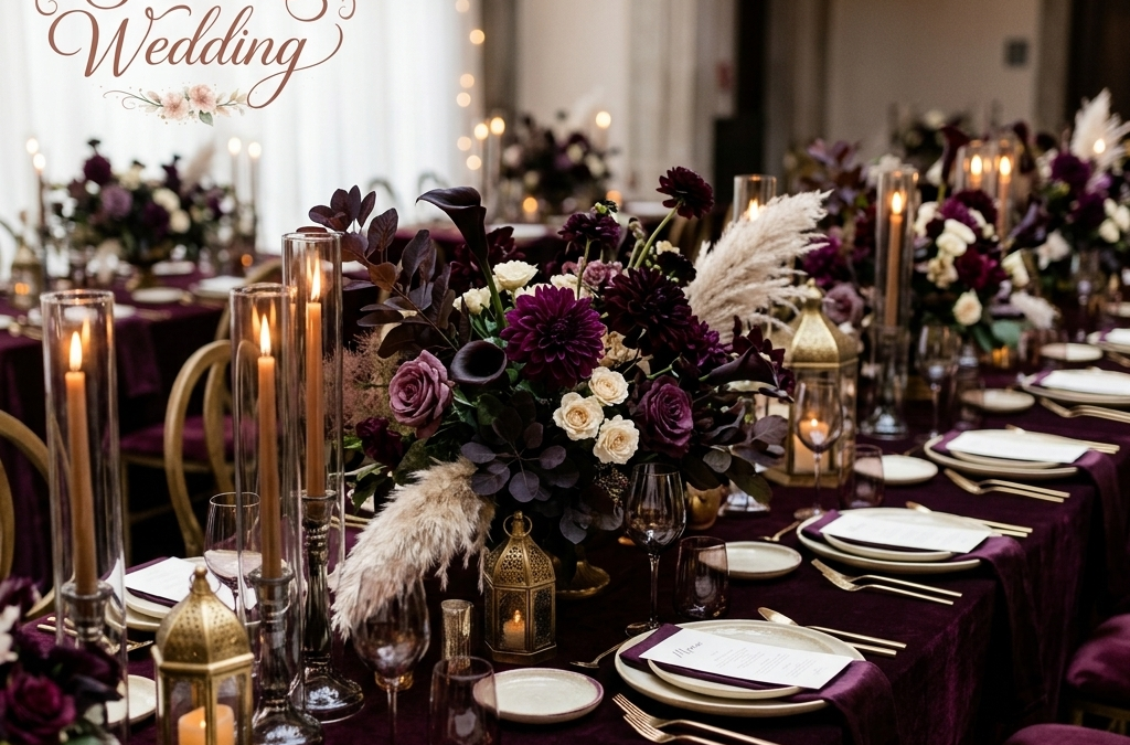
1. The High-Drama Romantic: Black Cherry, Aubergine & Creamy Ivory
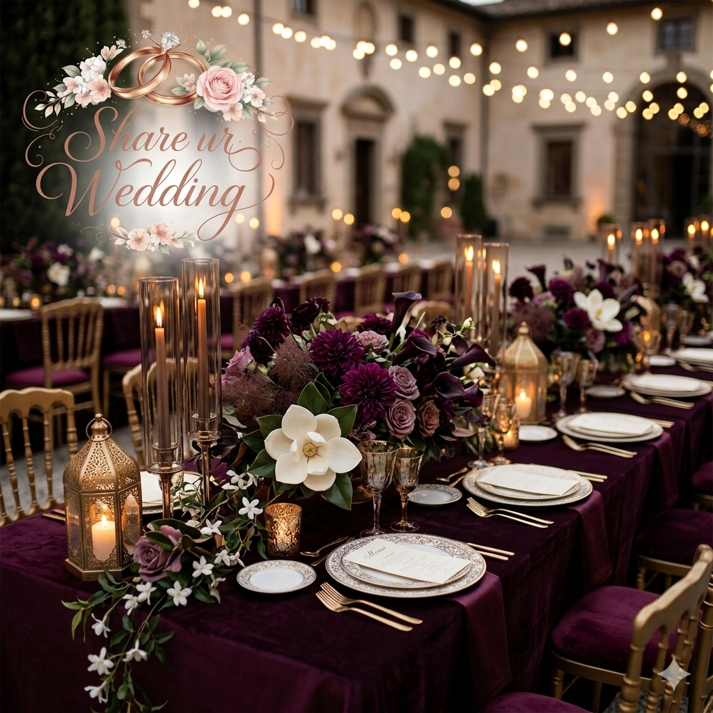
For couples who want to break away from standard bridal tropes, this deep, rich palette offers an opulent alternative. It feels incredibly romantic yet undeniably edgy.
-
How to Style It: Keep your tablescapes grounded with heavy, creamy ivory linens to prevent the room from feeling too dark. Layer in the drama using black cherry velvet napkins, dark burgundy calla lilies, deep purple tulips, and smokebush in your floral installations.
-
The Lighting Touch: Use warm, low-level amber candle lighting rather than bright overhead lights to let the dark hues feel cozy and expensive.
2. The Excess of Joy: Tomato Red, Peachy Gold & Lavender
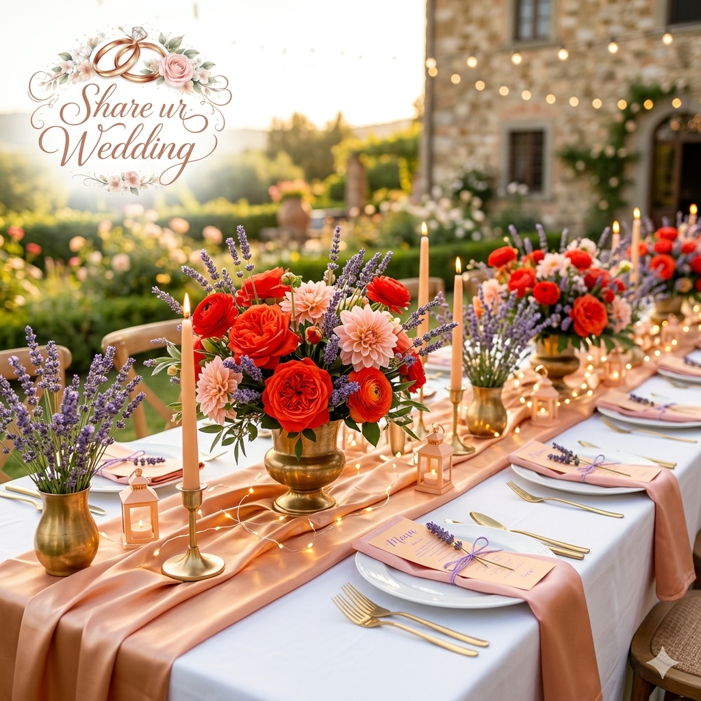
This combination is a direct response to couples wanting their celebrations to feel brilliantly optimistic and energetic. It blends fiery, hot-toned hues with unexpected cool accents.
-
How to Style It: Use vibrant tomato red and playful coral roses as the core of your centerpieces. Weave peachy gold satin runners across long wooden tables, and introduce soft lavender through delicate details like watercolor menu cards, taper candles, or delicate sweet pea sprigs.
3. The Editorial Statement: Cobalt Blue & Silver Mist
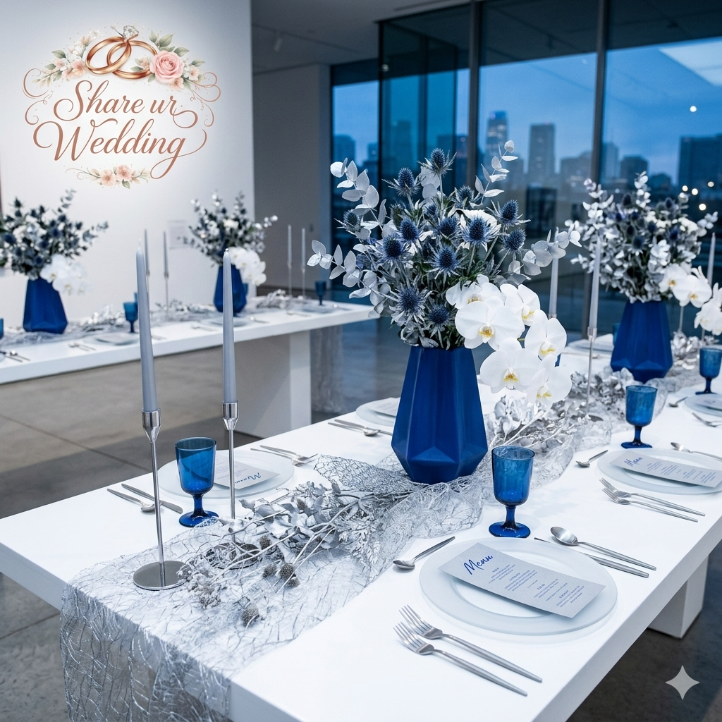
Cobalt blue has made a massive impact on the contemporary wedding scene. It is a confident, high-contrast hue that immediately gives a wedding an artistic, curated feel.
-
How to Style It: This palette works beautifully with minimalist design choices. Think crisp white table settings accented by cobalt blue glassware, hand-poured blue candles, or striking, single-variety floral arrangements. Pair it with silver mist fabrics or gray-lacquered structures to give it a clean, polished finish.
[ Pro Decor Tip for 2026 ]
Instead of using green foliage as an afterthought accent, treat your greens—like Sage, Olive, or Deep Moss—as one of your primary colors. Green is officially the new neutral.
4. The Earthy Luxury: Eucalyptus, Terracotta & Warm Cinnamon
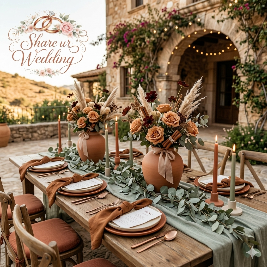
Perfect for late summer and autumn celebrations, this color story feels incredibly soulful, raw, and rooted in nature. It replaces high-shine metallics with warm, organic tones.
-
How to Style It: Utilize handmade terracotta pots, woven jute rugs, and rustic wooden cross-back chairs. Soften the earthy weight of the cinnamon and rust tones by layering flowing, cream-colored cheesecloth drapery, soft pampas grass, and pale peach garden roses.
5. The Gentle Renaissance: Butter Yellow & Soft Sage
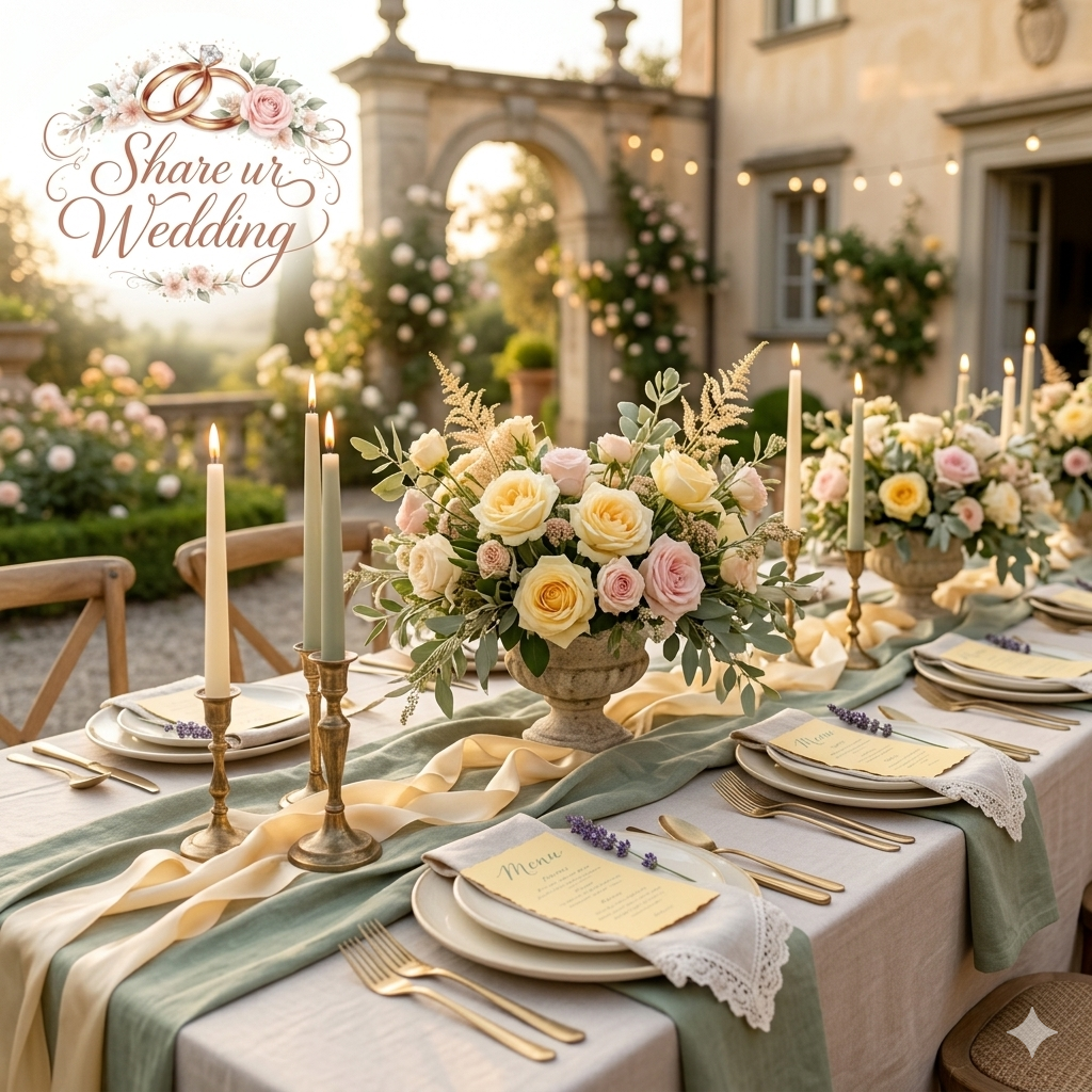
Yellow is experiencing a massive, soft revival. Instead of bright neon yellow, couples are falling in love with a creamy, comforting butter yellow that brings a nostalgic, vintage charm to the day.
-
How to Style It: This is the ultimate palette for an open-air garden party. Style your tables with soft sage green table linens, butter-yellow plates, or wild, loosely structured floral arrangements featuring chamomile flowers, yellow garden roses, and trailing eucalyptus.
Seasonal Guide: Selecting Color Schemes by Month
The natural light of your wedding day changes drastically depending on the time of year. A palette that looks airy and ethereal under a bright June sun can look cold and washed out in the middle of January. Use this quick checklist to align your color choices with the seasons.
Spring (March – May)
-
The Vibe: Fresh beginnings, airy, delicate, poetic.
-
Top Combinations:
-
Butter Yellow + Dove Grey + Crisp White
-
Lilac Haze + Apricot + Rosewater
-
Sky Blue + Silver Mist + Soft Ivory
-
Summer (June – August)
-
The Vibe: Sun-drenched, vibrant, highly energetic, celebratory.
-
Top Combinations:
-
Tomato Red + Coral Rose + Lavender Accents
-
Cobalt Blue + Stark White + Metallic Silver
-
Peach Fuzz + Sandstone + Warm Taupe
-
Autumn (September – November)
-
The Vibe: Earth-rich, cozy luxury, texturally deep, soulful.
-
Top Combinations:
-
Terracotta + Cinnamon Blush + Creamy Ivory
-
Cocoa Brown + Caramel Latte + Brass
-
Saffron Glow + Tuscan Marigold + Earthen Clay
-
Winter (December – February)
-
The Vibe: Regal heritage, moody romance, cinematic, opulent.
-
Top Combinations:
-
Black Cherry + Deep Aubergine + Gold Leaf
-
Emerald Forest + Deep Moss + Antique Champagne
-
Ruby Red + Deep Plum + Matte Silver
-
Step-by-Step Checklist: How to Build Your Wedding Color Blueprint
Don’t let endless Pinterest boards overwhelm you. Follow this systematic approach to lock in your wedding design with total confidence.
-
[ ] Step 1: Audit Your Venue’s Base Tones Look at the carpets, wall colors, window frames, and surrounding nature of your venue. Choose colors that complement the existing space rather than fighting against it.
-
[ ] Step 2: Establish Your Core Neutral Select a grounding baseline shade that will make up the majority of your large-scale elements (like drapes and main linens). Examples include Creamy Ivory, Warm Taupe, or Soft Oatmeal Beige.
-
[ ] Step 3: Choose Two Primary Dominant Colors These are the true heroes of your palette. They will appear clearly in your bridal party attire, your main floral installations, and your invitation suite.
-
[ ] Step 4: Select Your Unexpected “Pop” Accent Introduce one micro-accent shade to add visual intrigue and keep the palette from looking flat. For instance, add a tiny pop of lavender to a warm red and peach palette.
-
[ ] Step 5: Define Your Metallic and Textural Finishes Decide whether your design leans toward warm metallics (Brushed Gold, Antique Copper) or cool elements (Matte Silver, Clear Acrylic, Polished Chrome).
Frequently Asked Questions (FAQ)
What are the most popular wedding color combinations for wedding decor?
The most popular combinations focus on balancing rich, deep colors with soft neutrals. Palettes like Black Cherry and Creamy Ivory, Eucalyptus and Terracotta, and Cobalt Blue with clean whites are leading the wedding industry. The main shift is away from flat, single-tone pastels toward complex, layered color stories.
How many colors should be in a wedding palette?
An ideal wedding color palette consists of 4 to 5 shades. This includes one or two anchoring neutrals (like oatmeal, ivory, or taupe), two primary dominant colors that set the theme, and one distinct accent color used selectively for small details like stationery typography, glassware, or specific floral elements.
Is red still a trending wedding color?
Yes, but it has evolved into a much more sophisticated styling choice. Instead of bright, classic primary reds, couples are choosing deep wine hues, black cherry, or burnt rust for formal evening celebrations. For vibrant day events, a punchy Tomato Red paired with peachy gold and lavender is highly popular for a chic, high-fashion statement.
What is the best color combination for an outdoor garden wedding?
The best combination for a garden setting includes Soft Sage, Butter Yellow, and Creamy Ivory, or a soft, atmospheric Sky Blue paired with Silver Mist. These shades harmonize gracefully with natural green backdrops without competing with the beauty of the outdoor surroundings.
How can I make my wedding colors look “quiet luxury”?
To achieve a quiet luxury aesthetic, swap out high-contrast whites for layered, monochromatic warm neutrals like sand, almond, oatmeal, and buttercream. Focus heavily on premium, tactile textures—such as raw silk, heavy linen, and handmade stoneware—and use matte, brushed metals instead of high-shine glitter or chrome.
Bringing Your Color Story to Life
Ultimately, the best color combination for your wedding decor is the one that resonates deeply with your personal style and love story. Trends are an incredible source of inspiration, but your unique personality is what makes your celebration unforgettable. Take these palettes, experiment with fabrics and textures, and don’t be afraid to make a confident color statement on your big day.
What wedding color combination are you leaning toward for your celebration? Are you dreaming of a moody, high-contrast evening look, or a soft, sun-kissed outdoor palette? Let us know in the comments below!
For more expert wedding styling advice, trending tablescape guides, and step-by-step planning resources, explore our latest design features right here on ShareUrWedding.com.